War Dragons:
Navigation Standardization
Overview
After 2 years since launch, new features were developed. The UX/UI team found the original navigation outdated and ineffective. Some screens had unnecessary complexity. Preparing for more features, the team plans a new, trend-aligned navigation system.
My Roles:
Product Design
UX Design
Concept UI
User Research and Testing
Deliverables:
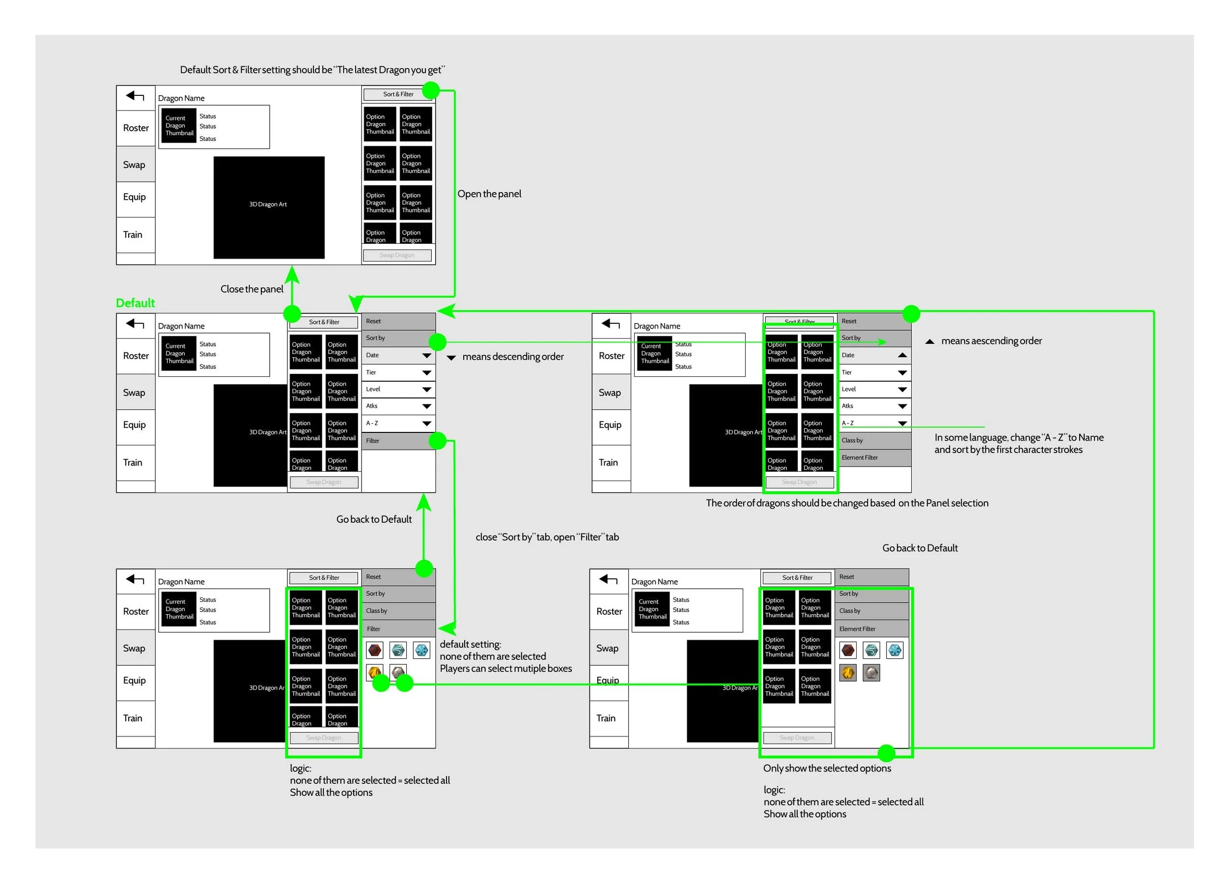
End-to-end User flows
Wireframe & High-fidelity UI
User testing report
Prototype
Platform:
Android & IOS
The Problem
Work with the UX Director to identify UX/UI issues in the old system.
Difficult to navigate
Many features were added over the years by multiple teams, and the UI interaction models didn't adhere to mobile game UI design principles.
Overuse of unnecessary screen pop-ups that contain too much information without a clear hierarchy.
Complicated
Design Goals
Utilize the new design system to enhance the early gameplay experience and metrics.
Standardization:
Lower the learning gap for early-game stage players.Simplification:
Enhance player quality of life by introducing a much easier access UI control scheme.Consistant:
Enhance early player retention and consequently LTV by improving players' gameplay understanding through a consistent navigation system.
My Design Process
To understand the best practices in the mobile game trend, I researched six competitor games under Action, RPG, Strategy, and Sports categories.
Competitor Research
Plan out the interaction flow for all tasks and functions in the current game and analyze the pain points.
UX Core Loop Analysis
Design Solution
Redesign Screens Architecture and Layout
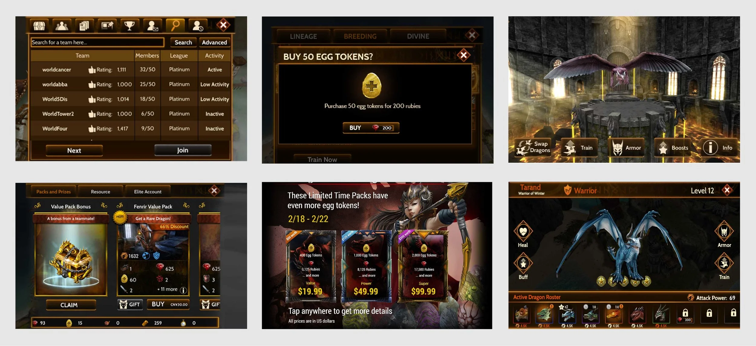
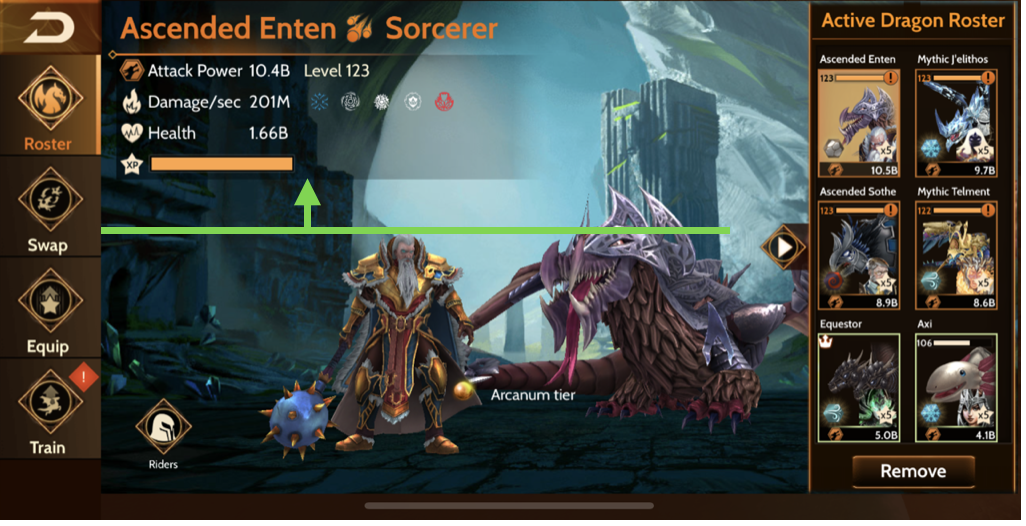
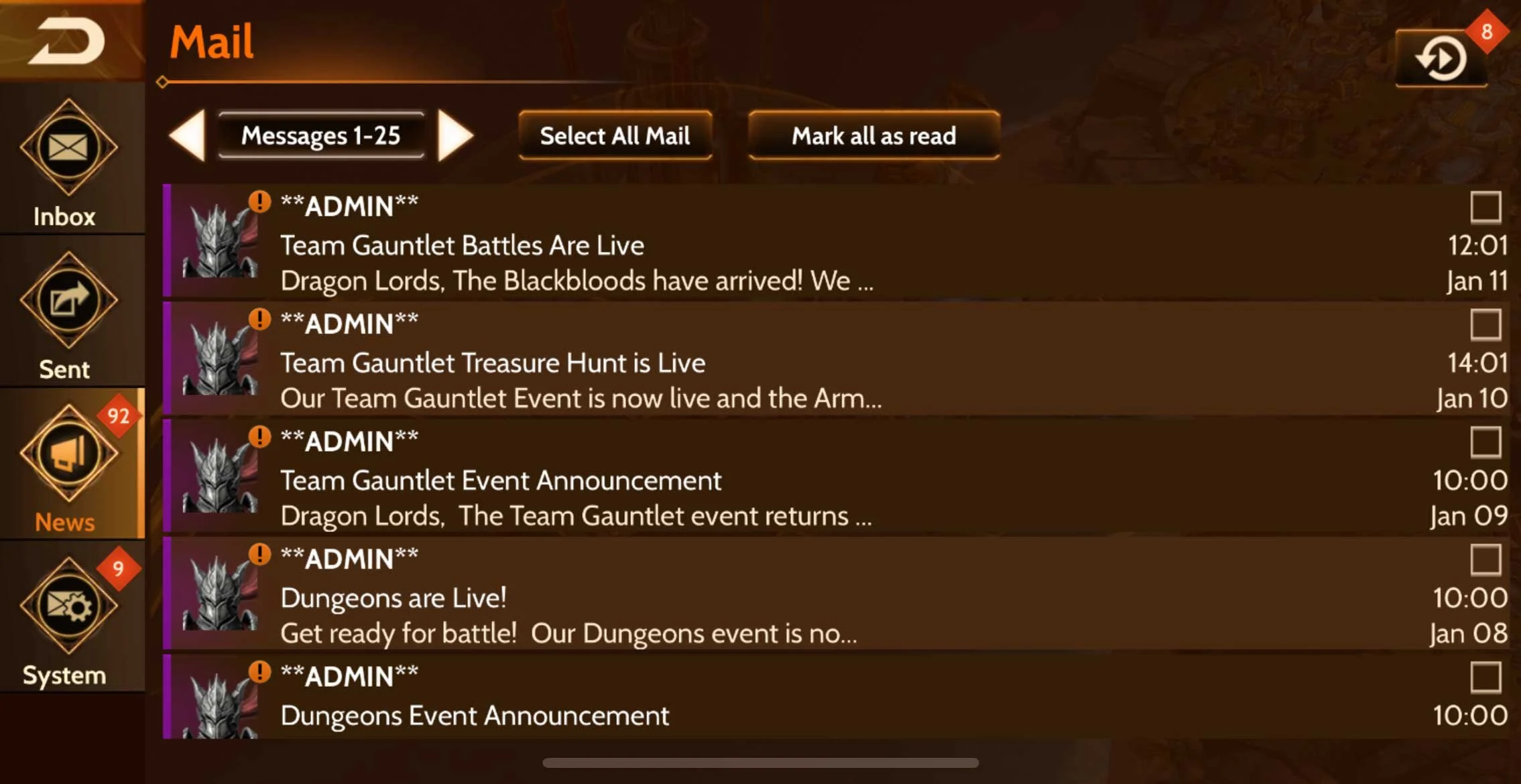
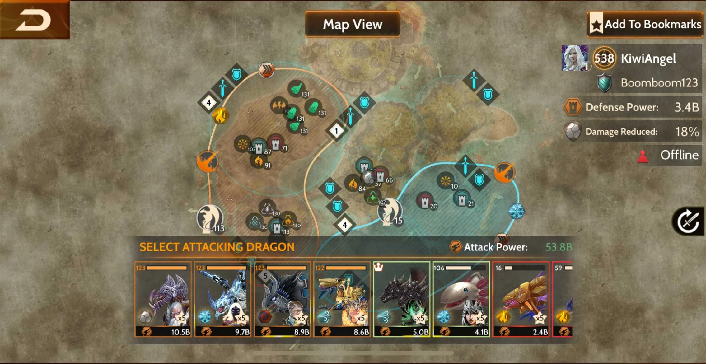
Restructuring the screen architecture throughout the game can aid player orientation, accessibility, and content discoverability by consistently placing user interface navigation elements. This makes the game more accessible to early players.
Consistent Use of Navigation Elements:
The back button is positioned in the upper left of the screen, allowing for a flatter UI navigation scheme. Additionally, sub-navigation menu components are situated to the left and right of the screen edges, facilitating easier access for players and fitting into a more natural ergonomic range of their thumb's reach.
Back button
Design Ideations
Wireframe
Implement the concepts and settle basic UI layouts with task flow.
Mock Up & Prototype
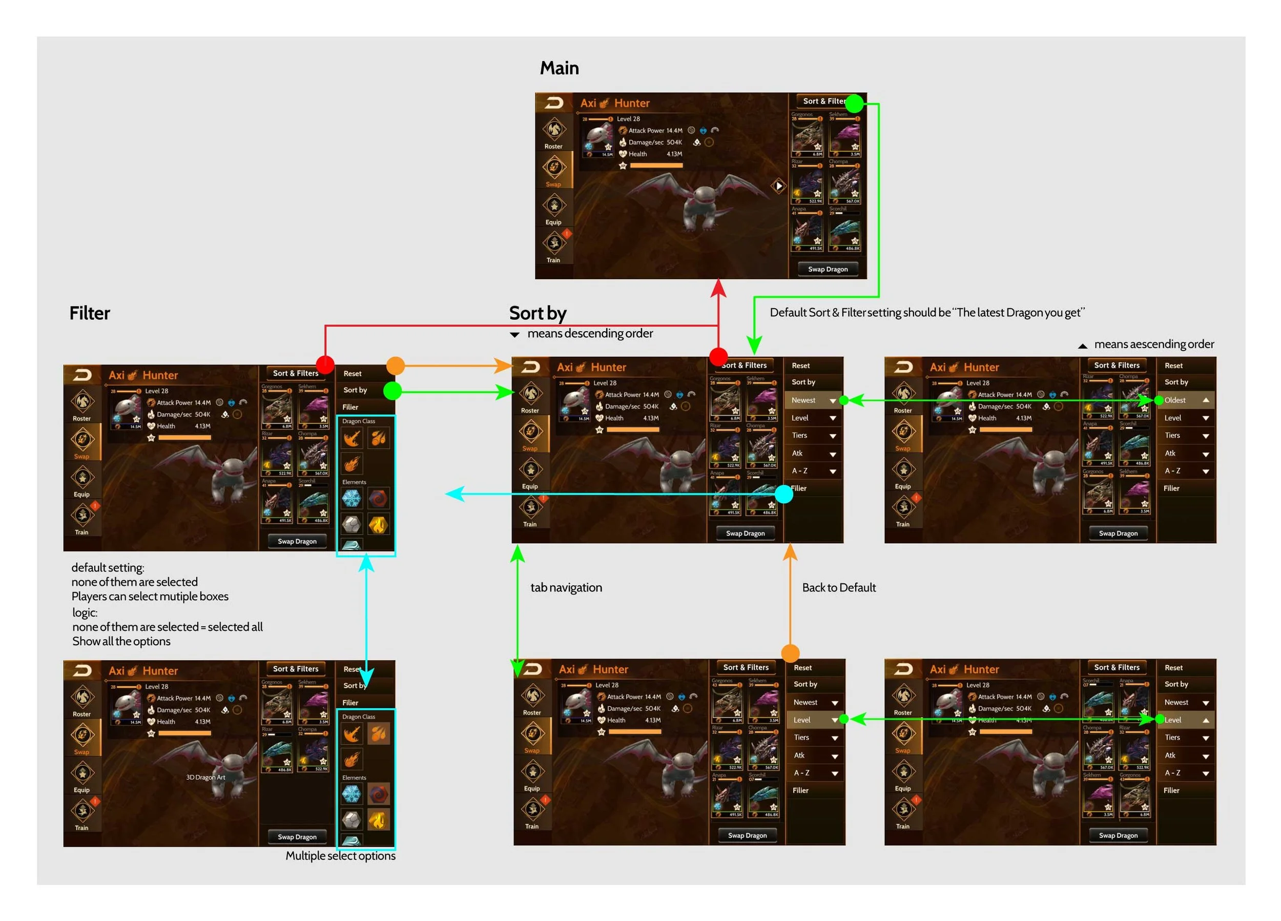
After an internal design review, implement the wireframe with a clean interface and create an interactive prototype for early tests.
Usability Testing
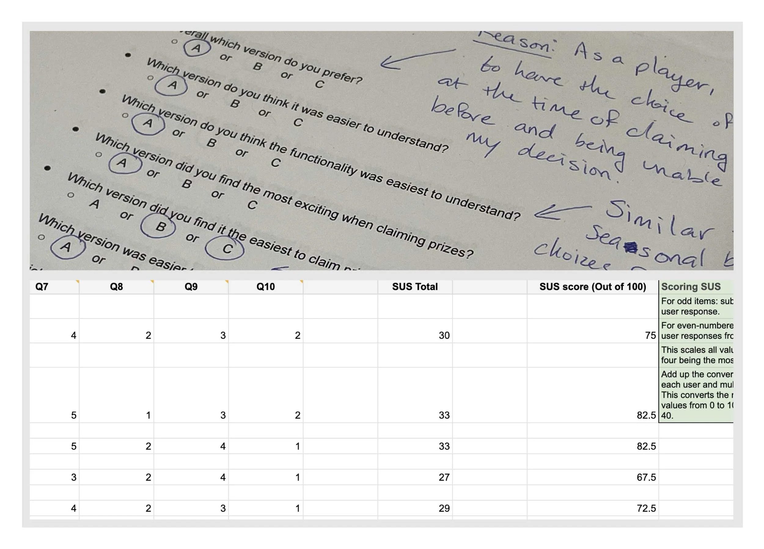
Conduct on-site AB testing with 10 players and utilize the System Usability Scale (SUS) to assess the build.
Feedback
Grant VIP users access to a restricted build, and collect their genuine feedback after experiencing this new design.
Community Reaction
Iterations
Ensure that the secondary tabs are appropriately balanced with the main focus area, maintaining clarity and hierarchy in the user interface. By reducing unnecessary space and simplifying the information presentation, we can optimize the user experience and enhance usability.
The second layer hierarchy
Final Design
Result
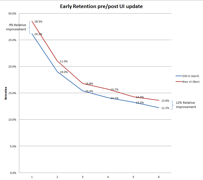
The Navigation standardization redesign account for over an 11% relative retention improvement in the early game.
This directly translates to an 11% improvement in LTV.
